You’ve seen the photos. White walls. A single branch in a vase. A sheepskin throw. Looks peaceful, right? But when you try it at home, your living room ends up feeling like a dentist’s waiting room — cold, bare, and deeply uncomfortable.
The problem isn’t the style. It’s that most people copy the look without understanding the logic. Scandinavian design isn’t about owning less. It’s about owning the right things. Here are 15 ideas that actually work.
1. The 80/20 Rule of White and Warmth
Pure white walls scream “hospital.” Pure beige screams “grandma’s house.” The fix? Use a warm white with a subtle yellow or gray undertone. NCS S 0502-Y (a soft, warm off-white) is the exact shade used in most Danish interiors.
Paint the walls that off-white. Then bring in warmth through texture — not color. A chunky wool throw in oatmeal. A linen curtain in natural beige. A jute rug underfoot. The contrast between the cool wall and warm textures is what makes it work.
Paint brand to look for: Jotun Lady Pure Color in “Sanded Stone” or Little Greene in “Light Stone.” Both hit that warm-neutral sweet spot.
2. The Three-Layer Lighting Rule
Scandinavians understand that overhead lighting is the enemy of cozy. You need three distinct layers:
- Ambient: A floor lamp bouncing light off the ceiling (not your face)
- Task: A reading lamp next to the sofa, directed at your book
- Accent: A small lamp on a shelf, highlighting a ceramic vase or stack of books
The Muuto Fluid Floor Lamp ($399) does the ambient job perfectly — its opaque shade throws light upward. For task lighting, the Hay PC Portable Lamp ($129) is cordless and dimmable. Move it where you need it.
Skip the dimmer switch on your main ceiling light. Use individual lamps instead. You’ll get warmer, more controllable light.
3. Stop Buying Matching Furniture Sets
This is the single biggest mistake people make. A matching sofa, armchair, and coffee table from a big-box store looks like a showroom. Not a home.
Scandinavian rooms mix eras and materials. An IKEA Klippan sofa ($299) from 2018 paired with a vintage teak side table from a flea market. A Muuto Around Coffee Table ($649) in oak next to a wool rug with a graphic pattern. The mix creates visual interest without clutter.
Rule of thumb: three materials per room. Wood, wool, and ceramic. Or leather, linen, and brass. Pick three. Stick to them.
4. The Coffee Table Tray Hack
Your coffee table is not a storage bin. If it has mail, remote controls, and a half-empty water bottle on it, you’ve already lost the Scandinavian vibe.
Buy a simple wooden tray (the IKEA SÖNDRUM at $14.99 is fine). Place it in the center of the table. On it, put exactly three things: a candle, a small stack of books, and a ceramic object (a vase or a small sculpture). That’s it.
The tray corrals the items into one intentional group. Everything else — remotes, coasters, glasses — goes in a drawer or a basket beside the sofa.
5. Rugs Must Be Bigger Than You Think
A tiny rug floating in the middle of the room makes the space look smaller. Scandinavian interiors use rugs that are large enough to anchor the furniture.
For a standard 3-seater sofa, you need a rug at least 200cm x 300cm. The front legs of the sofa should sit on the rug. The coffee table should sit entirely on the rug. If your rug is smaller than that, your room will feel disjointed.
Best bet for 2026: IKEA STOENSE flatwoven wool rug (200x300cm, $249). Natural wool, subtle pattern, neutral tone. Works with everything.
6. The 10% Black Rule
Scandinavian rooms aren’t all white. They use black as an accent — but only about 10% of the room. Black lamp bases. Black picture frames. Black legs on a sofa.
This small amount of black grounds the room and prevents it from feeling washed out. Without it, the room looks unfinished. With too much, it looks harsh.
Easy way to add it: swap your white lampshade for a black one. Or buy a black steel floor lamp. The Hay About A Lounge Chair ($699) in black leather is a classic example — it adds weight to an otherwise light room.
7. Greenery That Actually Survives
Fake plants look fake. Real plants that die look worse. The Scandinavian solution: use branches instead of leafy plants. A single branch of beech or birch in a tall ceramic vase. No leaves to drop. No watering needed. Just clean, graphic lines.
If you want a real plant, get a Sansevieria (Snake Plant) or a Zamioculcas (ZZ Plant). Both survive low light, irregular watering, and neglect. Put them in a simple terracotta or matte ceramic pot. No patterned pots.
8. Books as Decor (Not Reading Material)
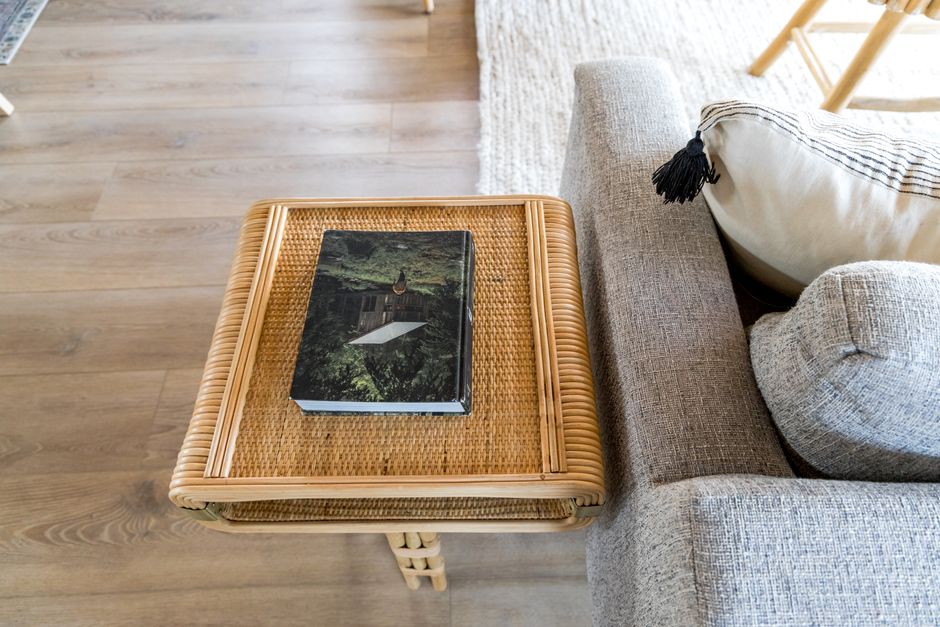
This sounds pretentious. I know. But hear me out: stacked horizontally, coffee table books add height, color, and texture. Use 3-4 large-format books stacked flat on a shelf or table. Choose books with neutral or muted covers — architecture, photography, or art monographs.
Don’t use your actual reading books for this. Keep those on a separate shelf or in a basket. The stacked books are purely visual anchors.
9. Storage Must Be Hidden
Open shelving looks great in photos. In real life, it collects dust and visual clutter. Scandinavian homes use closed storage — cabinets with doors, baskets with lids, drawers with handles.
The IKEA BESTÅ system ($150-$400 depending on configuration) is the workhorse here. Get it with doors. Put your TV equipment, game consoles, and kids’ toys behind those doors. The top surface gets one or two decorative objects. That’s it.
If you must have open shelving, limit it to one shelf per wall. Fill it with ceramic pieces or glassware, not plastic bins.
10. Textures Over Patterns
Patterns compete with each other. Textures complement each other. A Scandinavian room might have a sheepskin throw (fluffy), a linen curtain (crisp), a wool rug (rough), and a ceramic vase (smooth). No patterns needed.
When you do add a pattern, make it geometric and subtle. A Rörstrand Swedish Grace cushion cover ($45) has a repeating geometric motif in muted blue and white. It adds interest without shouting.
11. The One-Statement Wall Rule
Paint one wall a darker, muted color. Not a bright accent wall — a deep gray, a muted olive, or a soft charcoal. The rest stay white.
This creates depth without clutter. The dark wall recedes, making the room feel larger. It also provides a backdrop for lighter furniture to pop against.
Paint recommendation: Farrow & Ball “Down Pipe” (a soft dark gray) or Jotun “Elegant” (a muted sage green).
12. Candle Clusters, Not Single Candles
One candle on a table looks sparse. Three candles of varying heights on a tray or windowsill looks intentional. Use unscented, white, pillar candles. Place them on a simple ceramic or wooden tray.
The IKEA GLIMMA candles ($2.99 for a pack of 20) are fine. Group them in clusters of three or five. Light them in the evening. The flickering light is the closest thing to a fireplace you can get without renovating.
13. The 70cm Rule for Art
Art hung too high is the most common mistake. The center of the artwork should be at eye level — about 145-150cm from the floor. For a sofa, the bottom edge of the frame should be 15-20cm above the back of the sofa.
If you’re hanging a gallery wall, treat the entire group as one unit. Measure the total height and width, then center that unit at 150cm. Use a level. Yes, it matters.
14. When to Skip Scandinavian Design
This style isn’t for everyone. If you love maximalism, color, and pattern, Scandinavian design will feel restrictive. If you have young children or pets that shed, white wool rugs and light linen sofas will drive you insane.
In those cases, consider Japandi (Japanese + Scandinavian) — darker wood, more black, harder-wear fabrics. Or Modern Rustic — more texture, darker tones, more forgiving surfaces.
The point: don’t force a style that doesn’t fit your life. Scandinavian design works best for adults without small children who value calm over convenience.
15. The Final Test: Does It Feel Quiet?
Walk into your living room. Sit down. Close your eyes for 10 seconds. Open them. Does the room feel quiet? Or does your eye jump from object to object?
If it’s the latter, remove three things. A cushion. A magazine. A decorative object. Then test again. Repeat until the room feels still.
That stillness — not the white walls or the sheepskin or the Muuto lamp — is the entire point of Scandinavian design. It’s a room that lets you breathe.
Quick Comparison: Scandinavian vs. Other Minimalist Styles
| Feature | Scandinavian | Japandi | Modern Minimalist |
|---|---|---|---|
| Color palette | White + warm neutrals | Dark wood + muted earth tones | Black + white + gray |
| Key material | Light wood (birch, pine) | Dark wood (walnut, oak) | Metal, glass, concrete |
| Cozy factor | High (texture + candles) | Medium (wabi-sabi imperfection) | Low (clean lines, hard surfaces) |
| Best for | Small apartments, cold climates | Homes needing warmth + order | Large lofts, art collectors |
| Maintenance level | Medium (light fabrics need care) | Low (dark surfaces hide dirt) | High (dust shows on black) |
Stick with Scandinavian if you want a room that feels like a deep breath. If you need something more rugged or more colorful, look at Japandi or Modern Rustic instead. Either way, the goal is the same: a room that serves you, not the other way around.