
You pinned a dozen photos of grey sofas, white walls, and marble coffee tables. Now your own living room looks like a waiting room. The problem isn’t the color palette — it’s the execution. Grey and white done right feels calm, sophisticated, and layered. Done wrong, it feels cold, flat, and forgettable.
Most people make the same three mistakes: choosing the wrong shade of grey, forgetting texture entirely, and treating white as a single color. Here’s how to fix each one — and build a room that actually feels like home.
Why Grey and White Feels Flat (And How to Fix It)
The root cause is simple: equal parts grey and white with no third element. Your eye needs something to anchor the room. Without it, the space feels unfinished.
The fix is a 60-30-10 rule with a twist. 60% grey (walls or large furniture), 30% white (trim, ceilings, secondary pieces), and 10% a warmer accent — usually wood, brass, or a muted earth tone like terracotta or olive. That 10% is non-negotiable.
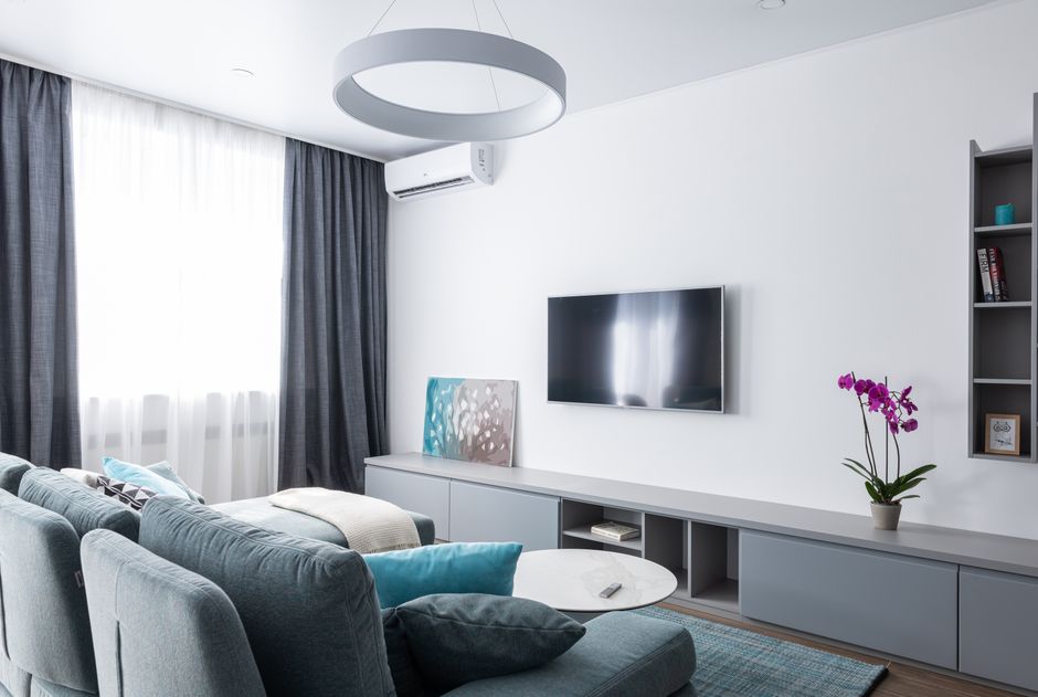
I walked into a client’s apartment last year. She had a charcoal sofa, white walls, white side tables, and a grey rug. The room was technically “grey and white” but it felt like a black and white photograph. We added a single walnut coffee table and three brass pendant lights. The room went from sterile to intentional in one afternoon.
The science backs this up. Color psychologists note that pure neutrals without a warm anchor can trigger feelings of detachment. Your brain registers the lack of chromatic warmth as “uninhabited.”
If you’re starting from scratch, pick your warm anchor first — a leather armchair, a wooden console, a copper lamp — then build the grey and white around it. Not the other way around.
Choosing the Right Grey: Warm vs. Cool Undertones
Not all greys are created equal. The undertone determines whether your room feels cozy or clinical.
Warm greys have yellow, brown, or red undertones. They read as greige or mushroom. These work in north-facing rooms with limited natural light. Cool greys have blue, green, or violet undertones. They look crisp in bright, south-facing spaces but can feel icy in dim rooms.
Here’s a quick reference for popular grey paint colors and their undertones:
| Paint Name | Brand | Undertone | Best Room Orientation | LRV (Light Reflectance Value) |
|---|---|---|---|---|
| Agreeable Gray | Sherwin-Williams | Warm (beige) | North, East | 60 |
| Repose Gray | Sherwin-Williams | Cool (blue) | South, West | 58 |
| Classic Gray | Benjamin Moore | Warm (yellow) | North, East | 73 |
| Stonington Gray | Benjamin Moore | Cool (blue-gray) | South, West | 65 |
| Pavilion Gray | Farrow & Ball | Cool (green) | South, East | 67 |
My pick for most rooms: Sherwin-Williams Agreeable Gray. It’s warm enough to feel inviting, light enough to keep a room open, and neutral enough to pair with almost any white. For a more dramatic look, try Farrow & Ball’s Down Pipe — a deep charcoal with a warm undertone that reads as almost black without feeling harsh.
Test your paint on the wall. Paint a 2×2 foot square and live with it for 48 hours. Watch it at noon, at dusk, and under artificial light. Paint colors shift dramatically depending on the light source.
Texture Is the Secret Ingredient
Here’s a hard truth: a grey velvet sofa on a grey carpet against grey walls is not a design. It’s a monochrome void.
Texture creates visual interest without adding color. In a grey and white room, texture does the heavy lifting that color would normally do. You need at least four distinct textures in the space.
Start with these categories:
- Soft and plush: A wool or cashmere throw, a shag rug, velvet cushions
- Hard and smooth: Marble or ceramic surfaces, glass, polished metal
- Rough and natural: Linen curtains, jute or sisal rugs, raw wood
- Lustrous and reflective: Brass or chrome fixtures, mirrored surfaces, silk
A concrete example. My own living room has a grey linen sofa (rough, matte), a white sheepskin rug (soft, fluffy), a black iron floor lamp (hard, matte), and brass side table (smooth, reflective). The photo doesn’t look grey and white — it looks rich and layered. The camera picks up the contrast between the matte linen and the shiny brass, even though both are neutral.
One texture trick that works every time: add a chunky knit throw in off-white over a grey sofa. The contrast between the smooth sofa fabric and the chunky knit creates instant depth. Cost? About $40 for a decent cotton knit throw from H&M Home or IKEA.
The White Wall Trap: Why Off-White Beats Pure White
Pure white paint (LRV 90+) looks stark and unforgiving. It shows every smudge, every shadow, every imperfection in your drywall. It also reflects light so aggressively that it can feel harsh, especially in rooms with large windows.
Use off-white instead. Off-whites have a hint of cream, gray, or beige that softens the room and creates a warmer backdrop. They also hide dirt better.
Three off-whites I recommend consistently:
- Benjamin Moore White Dove (OC-17): The most versatile off-white. Slightly warm, not too creamy, works with both warm and cool greys. LRV 85.
- Sherwin-Williams Alabaster (SW 7008): Warmer than White Dove. Pairs beautifully with greige and warm greys. LRV 82.
- Farrow & Ball School House White (No. 291): A soft, chalky white with a hint of warmth. Best in rooms with natural wood or brass accents. LRV 79.
Here’s the rule: your white should be one shade darker than you think you want. Most people pick a white that’s too bright, then wonder why the room feels cold. Go one step down the paint strip. You’ll get a softer, more forgiving finish.
Also: paint your ceiling the same off-white as your walls. A white ceiling against off-white walls creates a harsh contrast line that makes the room feel shorter. Painting the ceiling the same color (or one shade lighter) makes the room feel taller and more cohesive.
Three Grey and White Color Schemes That Actually Work
Here are three specific combinations I’ve used in real rooms. Each follows the warm anchor principle and includes texture guidance.
Scheme 1: Warm Greige + Cream + Walnut
Walls: Sherwin-Williams Agreeable Gray (warm greige). Trim: Benjamin Moore White Dove. Sofa: IKEA Kivik in beige-gray (light warm grey). Rug: jute or sisal (natural, rough texture). Accent: walnut coffee table, brass floor lamp, olive green velvet cushions. This scheme works in living rooms and bedrooms. The walnut and olive bring the warmth. The jute rug adds the texture. Total vibe: coastal farmhouse without being cliche.
Scheme 2: Charcoal + Pure White + Raw Wood
Walls: Farrow & Ball Down Pipe (deep charcoal, warm undertone). Trim: Farrow & Ball All White (cool white). Sofa: Article Sven in charcoal. Rug: white shag or sheepskin (soft, fluffy). Accent: raw oak shelving, black iron pendant lights, a single marble coffee table. This is high contrast and dramatic. It works best in rooms with high ceilings and lots of natural light. The raw wood keeps it from feeling like a nightclub.
Scheme 3: Pale Grey + Warm White + Brass
Walls: Benjamin Moore Stonington Gray (pale cool grey). Trim: Benjamin Moore White Dove. Sofa: West Elm Harmony in light grey linen. Rug: flatweave wool in cream and grey stripes. Accent: brass side tables, brass mirror frame, cream linen curtains, a single burgundy throw. This is the safest scheme for beginners. The brass adds the warmth. The burgundy throw adds the 10% color pop. It’s elegant without being fussy.
For any of these schemes, avoid matching your wall color to your sofa color. If your walls are light grey, your sofa should be darker or lighter by at least three shades. Otherwise, the sofa disappears into the wall.
Lighting Mistakes That Ruin Grey Rooms
Grey is a chameleon. It changes color under different light sources. A warm grey under cool LED bulbs looks purple. A cool grey under warm incandescent bulbs looks muddy.
Three lighting rules for grey and white rooms:
First, use warm light bulbs (2700K to 3000K) in all fixtures. Cool bulbs (4000K and above) make grey look blue and white look sterile. Stick to 2700K for living rooms and bedrooms, 3000K for kitchens and bathrooms. Philips Hue white ambiance bulbs ($15 each) let you adjust the color temperature throughout the day.
Second, layer your lighting. A single overhead light creates harsh shadows and makes the room feel flat. You need at least three light sources per room: ambient (ceiling or floor lamps), task (reading lamp or under-cabinet), and accent (picture light or directional spotlight on a plant or artwork).
Third, use lampshades that filter light. Bare bulbs are too harsh. A white linen drum shade (IKEA SKRUVBY, $25) softens the light and casts a warm glow on grey walls. A brass or chrome base reflects light upward, adding another layer of visual interest.
One more thing: avoid black lamp shades in grey rooms. Black shades create too much contrast and draw the eye away from the rest of the room. Stick to white, cream, or natural linen shades.
If your grey room still feels cold after painting and furnishing, the problem is almost always lighting. Swap your bulbs to 2700K. Add a floor lamp in a corner. Put a small lamp on a side table. The difference is immediate.

